CozyPaws
Redesigning the pet hotel booking experience so owners can see availability before they hand over anything.
Pet Hotel Booking Website · UX Research · Web Design · Alberta, Canada
My role
Sole designer and researcher, end to end
Methods
2 in-depth user interviews · Competitive benchmarking of Alberta pet hotels · Affinity mapping · Journey map · Personas
The move
Flipped the booking flow: availability first, personal details last
Status
UX Design Institute diploma project. All three researched pain points addressed in the hi-fi prototype
3
Major Pain Points
Found in research, all three solved
77%
Pet-Owning Canadians
The audience this serves
1st
Availability Shown
Before any personal details
0
Accounts Required
To check dates and book
77% of Canadians own a pet.
When Canadians travel, and over 10 million did in early 2023, their pets need somewhere safe, loving, and fun to stay. The problem? Booking it was a nightmare.
Pet Ownership
77% of Canadian households
Canadian Travellers
10M+ trips abroad (Jan–Apr 2023)
Design Approach
Walk in the park as breadcrumb UX
Brand Color
Maximum Green #4A9405, calm & fun
What's stopping pet owners
Call to Check Availability
Most Alberta pet hotels required a phone call just to see if a room was free, before any booking could begin.
Details Before Availability
Some websites asked for full personal information and account creation before even showing available dates.
No Special Needs Input
Pets have schedules, medications, dietary needs. Most platforms had no way to capture this, a dealbreaker for loving pet owners.
The Walk to CozyPaws
Leash Up: Time for a Walk
Understanding the pet owner's booking experience firsthand
When Canadians travel (and over 10 million did in early 2023), their beloved pets need somewhere safe to stay. I started by talking to pet owners who had tried to book pet hotels in Alberta. What I found was a process stuck in the past: phone calls to check availability, hold music, blind trust. No availability calendars, no room previews, no way to communicate your pet's specific needs. The emotional arc was exhausting before a booking even began.
A massive, underserved market with a clear UX gap: pet owners were being failed at the very first touchpoint.
Sniffing Around: Naming the Problem
Affinity diagram, journey map, and personas surfaced three failure points
I ran in-depth interviews with two pet owners who had booked or attempted to book pet hotels. Every insight was clustered into an affinity diagram, surfacing three critical failure points: requiring a phone call just to check availability, asking for personal details before showing dates, and having no way to communicate a pet's special needs. I then built a user journey map to visualize the emotional arc (frustration spikes were alarming) and developed user personas to anchor every design decision in real human context, not assumptions.
The journey map revealed users were abandoning the process before they even reached a booking screen. That single insight defined the entire design direction.
Reading the Park Signs
Competitive audit + the idea that changed everything
A competitive audit across Alberta pet hotel websites confirmed the pattern: every competitor led with account creation or personal forms. The breakthrough idea was structural: flip the flow entirely. Show availability first, ask for personal information last. The breadcrumb navigation concept emerged from this same thinking: frame the booking steps as a walk through the park, each step a trail stop, making the process feel like a pleasant outing rather than a bureaucratic form. Maximum Green (#4A9405) was chosen to evoke calm and safety, because a stressed pet owner needs the page itself to feel reassuring.
The biggest ideation win had nothing to do with visuals. Reordering the flow was the single most impactful design decision.
The Evidence Behind the Decisions
Every design choice in CozyPaws traces back to something a real user said or did.
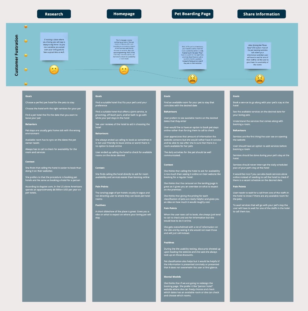
User Journey Map
Frustration peaked before users ever reached a booking screen, the research that made the design decision obvious.
Structured user interviews with pet owners who had booked or attempted to book Alberta pet hotels surfaced a critical finding: the frustration arc spiked at the Homepage and Pet Boarding Page stages, not at checkout. Users were abandoning before they could even confirm availability. This single insight directly informed the core design decision: show availability first, ask for personal information last. The journey map also revealed that users wanted services visibility before committing to a room, shaping the Add-ons flow.
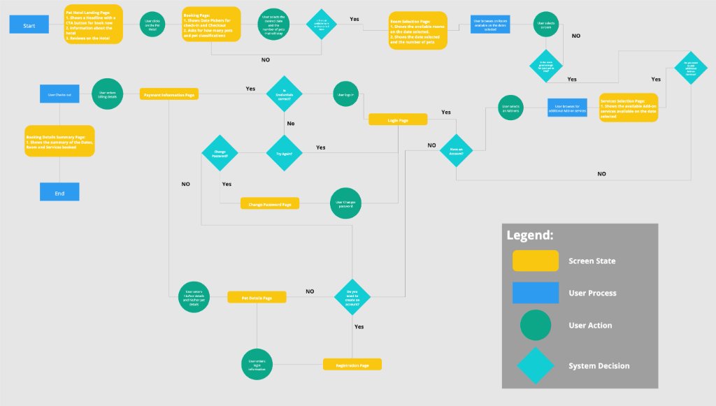
User Flow Diagram
Availability first. Personal details last. The flow is the design.
The user flow maps every decision point and system state across the entire booking experience, from landing page through checkout. The key structural decision (surfacing date selection and availability before account creation or personal details) is visible in the flow architecture itself. Guest checkout (no account required) was included after research showed that forced registration was a top abandonment trigger on competitor sites. Every screen state and decision branch was mapped before a single pixel was designed.
Finding the Right Trail
Every screen maps directly back to a research finding
With the user flow defined, I built the high-fidelity prototype. The homepage leads with a booking widget (dates, pet count, and pet type) before any personal information is requested. The availability calendar opens inline, no account required. Services and add-ons are visible before commitment. A free-text Special Request field for pet-specific needs was included at the Add-Ons step, directly solving the third pain point identified in interviews. Personal and payment details appear only at the final step, after the user is already invested and informed.
Every visual and structural decision mapped back to a specific research finding.
Every Screen, a Decision
Each step of the booking flow maps back to a specific research finding.
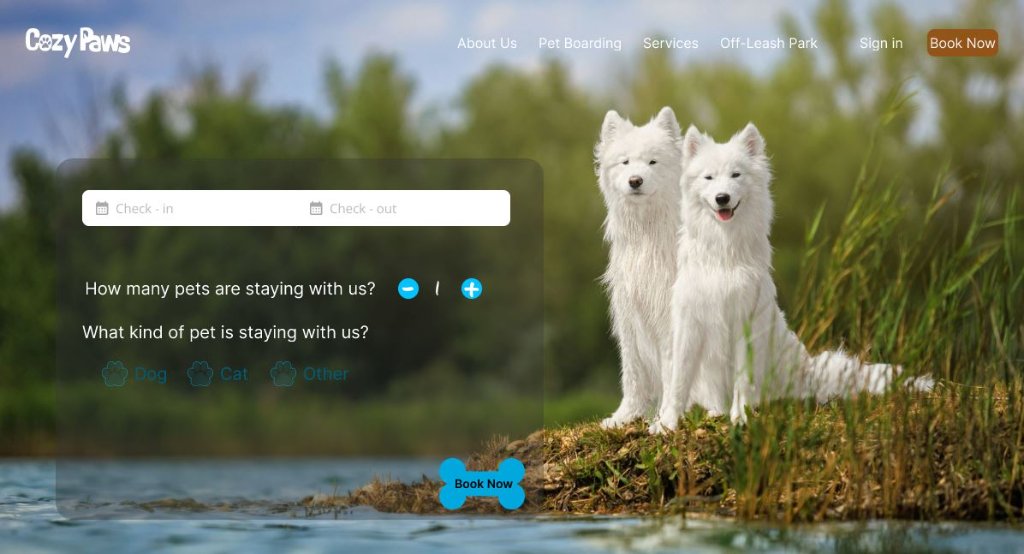
Availability first
The homepage leads with a booking widget (dates, pet count, and pet type) before a single piece of personal information is requested. This directly addresses the primary drop-off point identified in research: users were abandoning competitor sites before ever seeing a room.
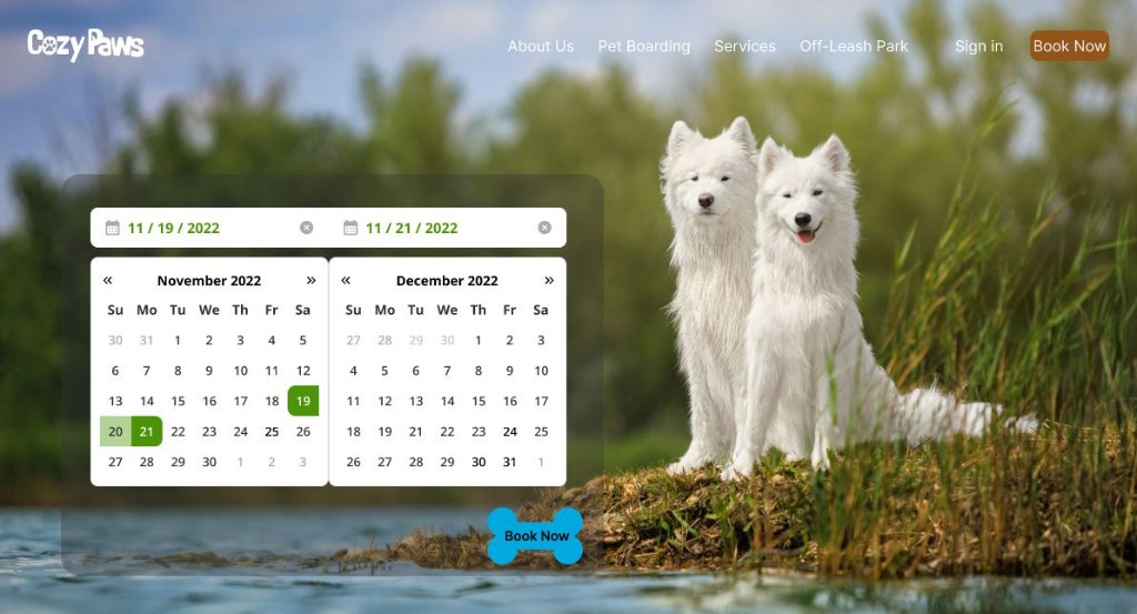
See your dates, then decide
The availability calendar opens inline on the homepage, no account required. Users can confirm their dates are available before investing any further time in the process, eliminating the frustration of discovering unavailability after filling out a form.
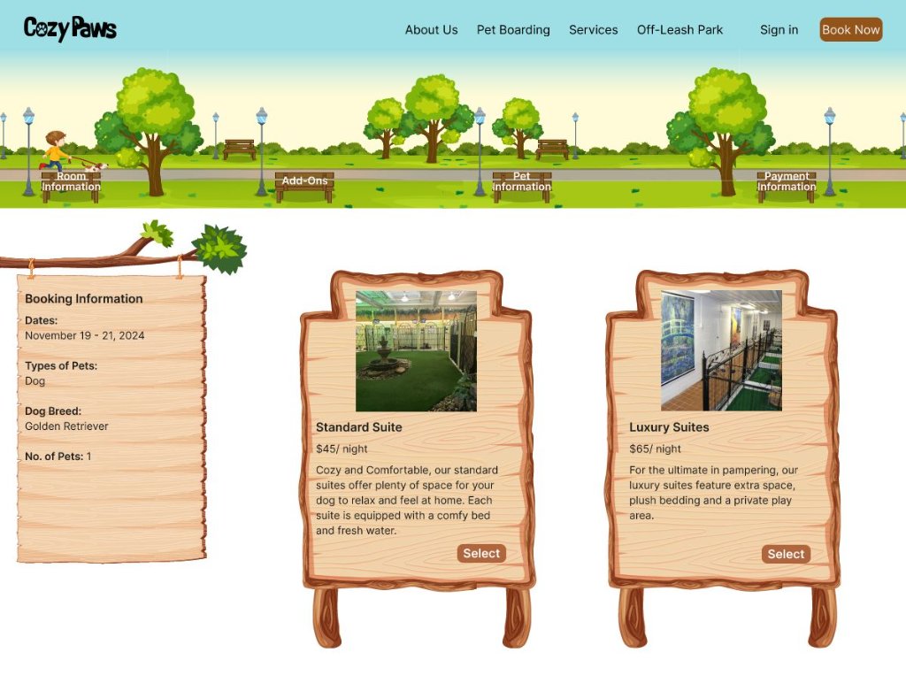
The walk in the park navigation
The breadcrumb navigation is literally a character walking a dog through a park, with each booking step labeled as a trail stop: Room Information, Add-Ons, Pet Information, Payment. The metaphor was not decorative. It was a deliberate emotional design choice to make the process feel like a pleasant outing, not a bureaucratic form.
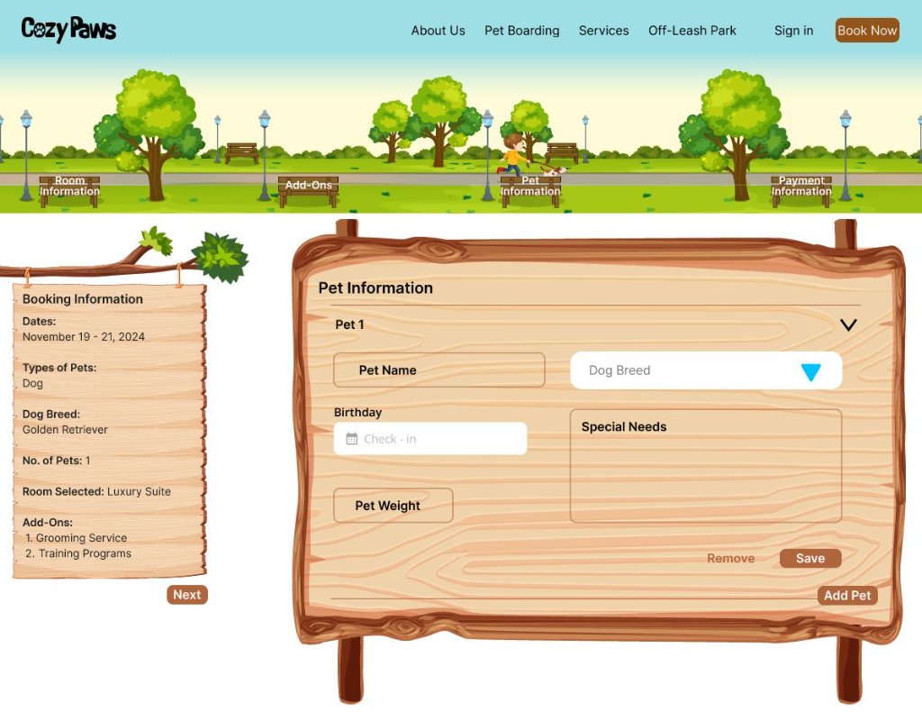
Special needs, finally addressed
The Add-Ons step includes a free-text Special Request field for pets with unique needs, schedules, or medications. This directly solved pain point 3 from research: no existing Alberta pet hotel platform had any way to capture pet-specific requirements, which was described by interviewees as a dealbreaker.
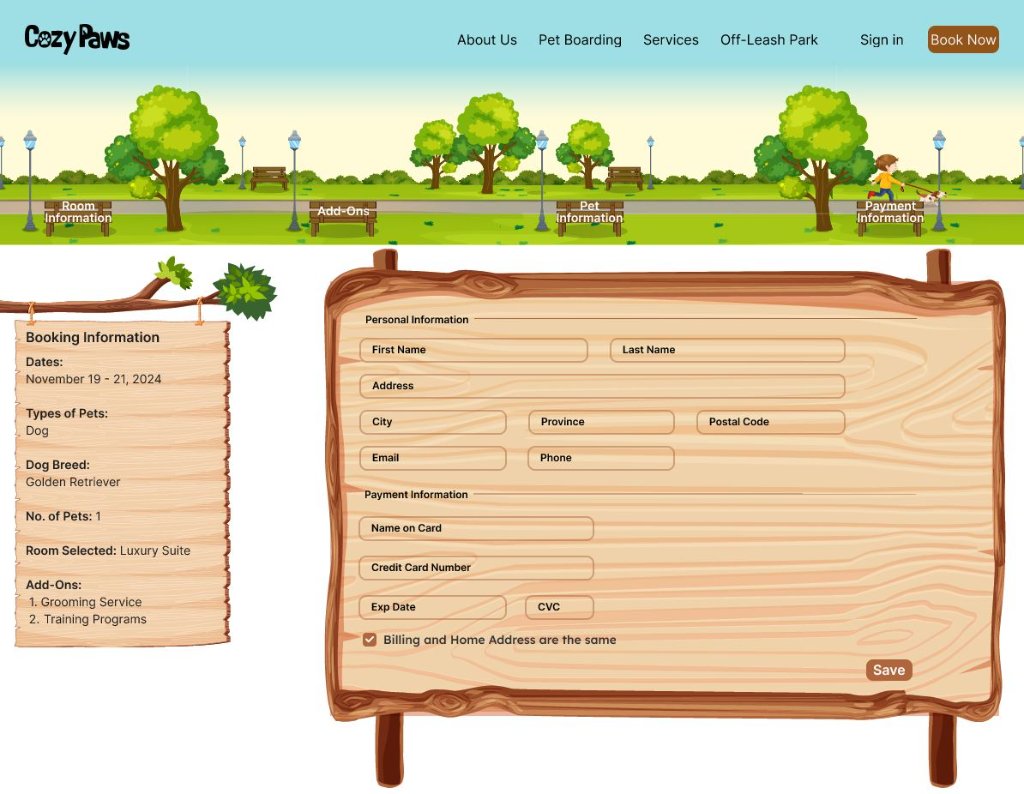
Personal information: last
Personal and payment details appear only at the final step, after the user has already selected dates, a room, services, and entered their pet's information. By this point, the user is invested and informed. Placing this form first, as competitors did, was the single biggest cause of abandonment identified in the journey map.
Arriving at the Hotel
Where pets feel at home, and fun never ends.
The final design answers each research pain point directly: availability shows before any personal details, no account is required to book, and a Special Request field captures pet-specific needs at the Add-Ons step. CozyPaws is a concept project, so the honest measure of success is traceability: every screen decision maps to a specific interview finding. If it shipped, the first things I would measure are booking-flow completion rate and drop-off at the personal details step, the exact places where the competitors I audited were losing people.
Check Dates
Browse Rooms
Add Services
Special Needs
Built with feeling
Colors were chosen to make the experience feel like what it is, a happy, relaxed outing with your best friend.

Maximum Green
#4A9405Relaxing, grounding, natural. Evokes parks, grass, and calm outdoor energy. The primary brand color.
Windsor Tan
#AF663DWarm, earthy, and welcoming. Reflects the warmth of wood, autumn walks, and a cozy, pet-friendly space.
Caveat Brush
HeadingsWhere pets feel at home
Playful, hand-lettered, and full of personality, Caveat Brush brings a warm, informal charm to headings that feels instantly inviting and pet-friendly.
Inter
Body TextBook your pet's perfect stay.
Clean, modern, and highly legible, Inter ensures effortless readability across all informational content, building trust throughout the booking experience.
Beyond the Happy Path
Every flow decision is a trade. Putting availability first means asking for dates before showing anything inspiring, so the design leans on the room content later in the flow to rebuild warmth. And an availability-first flow has an obvious failure mode: if nothing is available, the very first screen becomes a dead end. A happy-path prototype can ignore that. A shipped product can't.
So here are the states I would design first if CozyPaws went to build, in priority order, because unhappy paths are where booking products actually win or lose users:
No availability
Never a dead end: suggest the nearest available dates and nearby room types, and offer a notify-me option for cancellations.
Booking conflict
Two owners grab the last room at once. The loser needs an honest error, a held alternative, and no double charge.
Add-on unavailable
Grooming fully booked on the selected dates: show it as unavailable at selection time, not as a surprise at checkout.
Loading & error states
Skeletons while availability loads, retry paths on failed payment, and a clear save-and-resume for interrupted bookings.