Just Craftine
Handmade with heart, just for you.
Brand Identity · Brand Guidelines · E-Commerce Website · Custom Craft & Print · Alberta, Canada
My role
Sole designer and builder: brand identity through working storefront and admin panel
Methods
Market audit · Brand strategy · Identity system · Order lifecycle and dashboard design
The move
Chose a custom build over Shopify to design a bespoke back office around how the owner actually works
Status
Live for a real client at just-craftine.base44.app
justcraftine.base44.app
A fully functional e-commerce website: warm, joyful, and entirely on-brand.
Just Craftine
justcraftine.base44.app
View Live SiteBrand Identity
End-to-End
Color Palette
3 Brand Colors
Logo Concepts
3 Variations
Website
Live & Functional
Made with Love
Structured as Empathize → Define → Ideate → Prototype → Test & Outcome. A brand built from the heart, executed with craft.
A Mom, An Engineer, A Dream
Mixed-method discovery research · Dec 2025 – Jan 2026
Justine is a professional engineer by day and a maker at heart. What started as personalized handmade gifts for people she cared about grew into a small business, Just Craftine. The products were warm, intentional, and full of care. But online, none of that came through. To understand why, I conducted a structured discovery research phase: a 17-question brand discovery questionnaire and a 13-question ideal-customer mapping questionnaire with Justine, plus a 15-question customer feedback questionnaire with two returning customers, Diane and Joyce. Four findings shaped everything that followed. First: discovery is entirely word-of-mouth. Both Diane and Joyce found Just Craftine through friends. The brand has no inbound mechanism: the website and social aren't doing acquisition work yet. Second: pricing is a friction point that both sides independently named. Justine identified "price, size and shipping" as the biggest obstacle for clients. Joyce independently said she "needed more guidance" on pricing. Owner intuition matched customer experience exactly. Third: customers want more visible choice. Joyce's top improvement ask was "more choices." Justine sees a broad catalogue (toques, chopping boards, mugs, tumblers, stuffies, blanks-on-request), but customers don't perceive the range. This is a presentation and discoverability problem, not a product problem. Fourth: the brand voice and the e-commerce mechanics pull in opposite directions. Justine wants the site to feel "friendly and approachable, like a neighbor" while also asking to "avoid too much words and ads." That means visual storytelling and product imagery must carry the brand voice, not copy.
"I want them to feel special. Every gift is handmade and personalized."
– Justine, founder
"Local, very affordable, and trustworthy seller."
– Diane, customer
"Quality over quantity."
– Joyce, customer
"I needed more guidance on pricing."
– Joyce, customer
The research surfaced two core tensions: personalization vs. self-serve, and affordability vs. perceived value. Justine's strength is conversational, custom work, but conversation doesn't scale to first-time visitors who haven't been referred yet.
How Might We
How might we help first-time visitors discover Just Craftine's range without needing a referral?
How might we make pricing transparent without losing the conversational, personalized feel?
How might we let product imagery and personalization examples carry the brand voice with minimal copy?
The Problem with Generic
Three research-confirmed gaps. One clear design direction.
The research pointed to a compounding problem: most small craft businesses default to generic templates (stock logos, borrowed aesthetics, off-the-shelf stores) that erase the maker's personality. For Just Craftine, the gaps were specific and research-confirmed: no inbound discovery, no pricing clarity, and a product range that wasn't visible even to loyal customers. The design challenge wasn't just to build a brand; it was to build one that could do the discovery and communication work that word-of-mouth was doing alone. The scope covered logo design (logomark, full logo, and monogram badge), a comprehensive brand guidelines document, color system, typography selection, corporate assets (business cards, thank-you cards, shirt tags, packaging), and a live e-commerce store.
This wasn't just design. It was giving a hardworking mom's passion the professional presence (and the discovery engine) it deserved.
The Brand, Applied
Every touchpoint, digital and physical, designed to feel like Just Craftine.
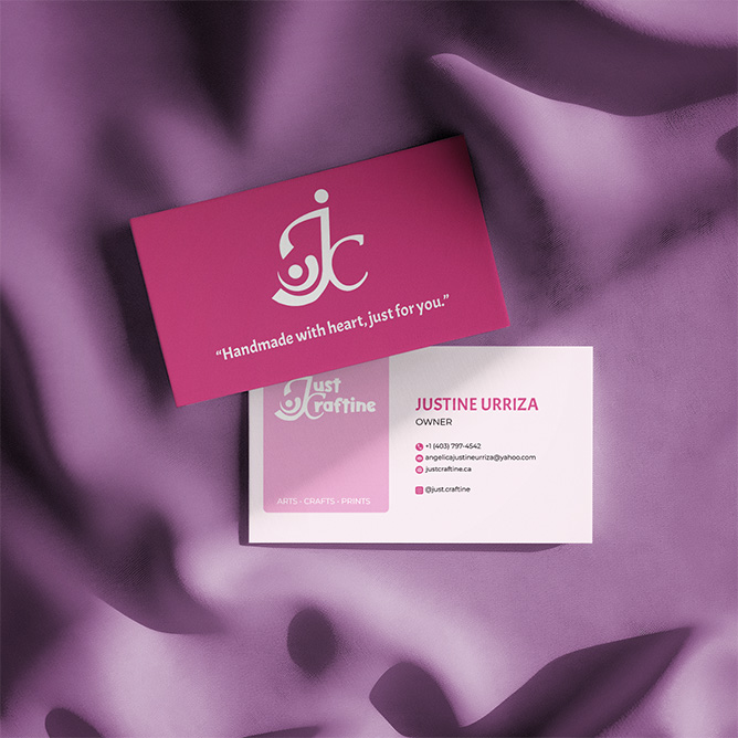
Front & Back
The JC monogram on a Fuchsia Purple background on the front: bold brand presence in a small format. The back uses Acme for the name and Montserrat for contact details, balancing warmth with readability. Every typographic decision mirrors the brand guidelines.
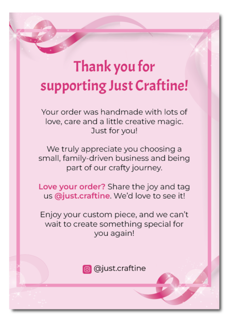
The unboxing moment
Designed to make every customer feel like they received a gift, not a package. Ribbon and sparkle accents reinforce the handmade aesthetic. The Instagram callout (@just.craftine) encourages community and repeat engagement, a deliberate brand-building touchpoint.
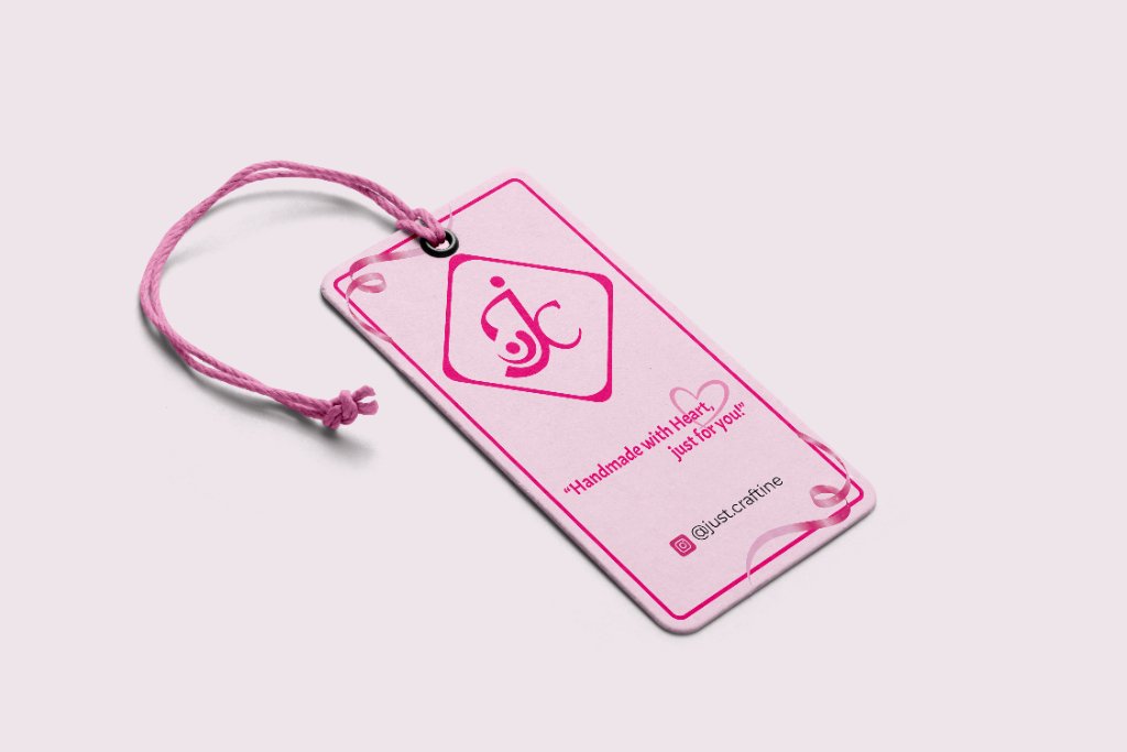
Small format, full brand
The JC monogram badge variation was created specifically for small-format applications like this. The badge shape was designed to work as a stamp, label, and hang tag, a decision documented in the brand guidelines to ensure consistency across all physical products.
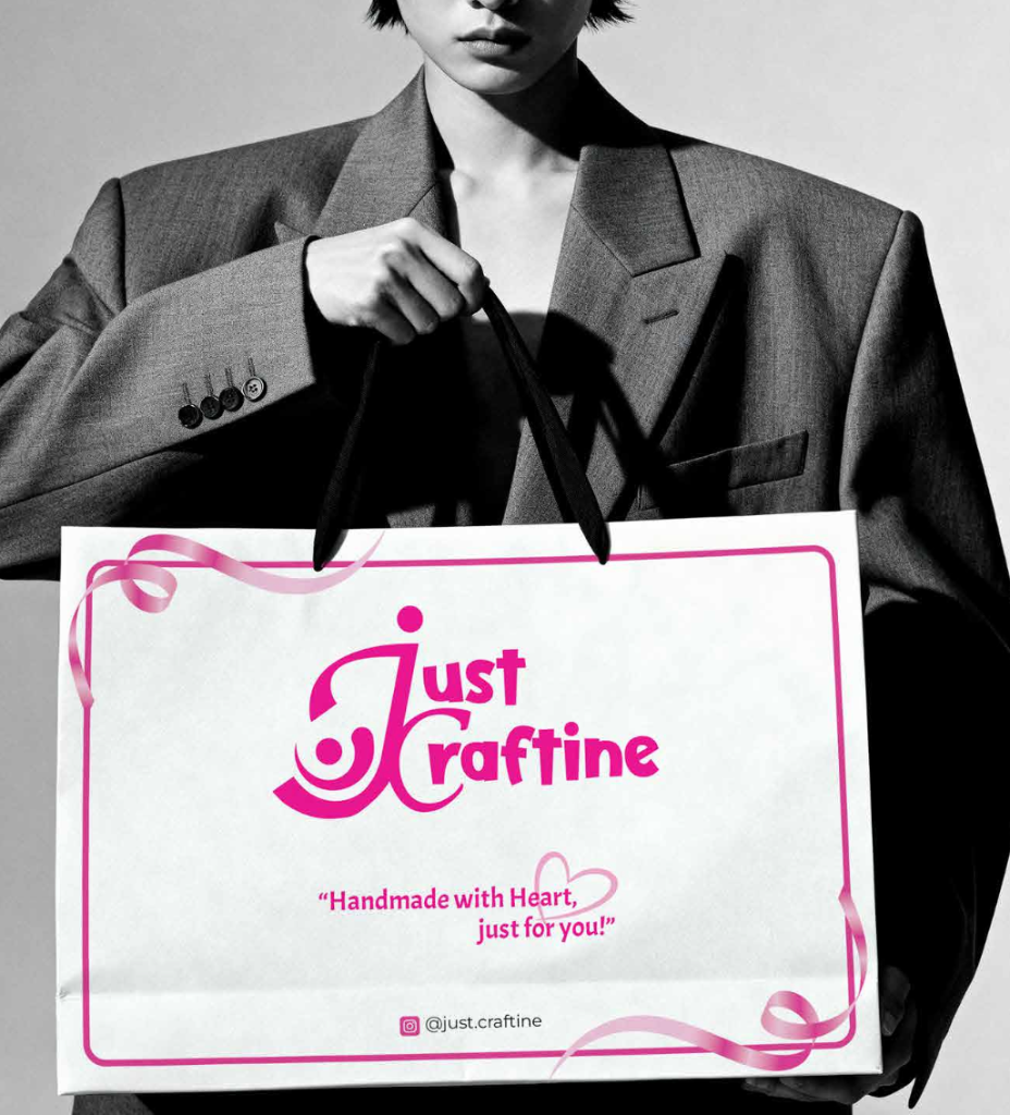
Every order feels like a present
Paper packaging over plastic was a deliberate brand decision: it signals handmade, thoughtful, and eco-conscious values. The packaging design uses ribbon accents and the full logo at large scale, making the bag itself a brand statement at markets and pop-ups.
Building the Identity
Fuchsia Purple, Sweet Lilac, Barely Pink, Acme + Montserrat
Every design decision was intentional and traceable back to the research. The research showed customers valued warmth, personalization, and trust above all. The JC logomark subtly references a mother holding a baby, honoring Justine's identity as a mom. The same curves echo the motion of craft scissors, connecting to the handmade process. The color palette of Fuchsia Purple (#B02761), Sweet Lilac (#E8B5CE), and Barely Pink (#F8D7DD) was chosen to feel warm, soft, and gift-ready without being childish. Acme for headings, Montserrat for body text. Because customers couldn't perceive the product range, the shop architecture was designed with filterable categories to make the catalogue legible at a glance. And because the brand voice needed to be carried visually, not through copy, every touchpoint was designed to feel like unwrapping something made with love.
The logo concept has two meanings layered in one mark: a mother's embrace and a crafter's scissors. Intentional storytelling through visual design, not words.
From Brand to Browser
A full e-commerce experience, shop, about, and cart.
With the brand identity locked in, I built the Just Craftine website: a fully functional, mobile-friendly e-commerce store. The site features a warm pink hero with product imagery, a shop page with filterable product categories (apparel, plushies, custom gifts), an About page that tells Justine's story, and a functional cart system. Every UI element, from buttons to section dividers, was designed to reflect the brand's gentle, handcrafted aesthetic. The result felt as personal as the products themselves.
The website lives at just-craftine.base44.app, a real, working storefront for a real family business.
From Brief to Browser
A real brand. A real website. A real Alberta small business, live on the internet.
See it live
Just Craftine is a fully functional e-commerce store: shop page with filterable categories (apparel, plushies, custom gifts), an About page telling Justine's story, and a working cart. Every UI element was designed to reflect the brand's gentle, handcrafted aesthetic. And it's live, a real business taking real orders.
Shop
Product listings live
Cart
Fully functional
About
Brand story page
Mobile
Fully responsive
Handmade with Heart, Just for You
A complete brand and a live website for a thriving small business.
Just Craftine now has a full brand identity, logo system, color palette, typography, brand guidelines, business cards, thank-you cards, shirt tags, and packaging. The live website at just-craftine.base44.app gives Justine, a real Alberta small business owner, a professional digital storefront to showcase and sell her custom crafts to customers across the province. More importantly, the brand now tells the right story: a loving mom who pours care, creativity, and heart into every single piece she makes.
Brand Identity
Brand Guidelines
Corporate Assets
Live Website
The Color Palette
Soft, warm, and feminine. Every color tells part of the Just Craftine story.
Fuchsia Purple
#B02761Pantone 18-2436 TCX
The primary brand color. Vibrant, energetic, and bold, representing creativity and strong brand recognition.
Sweet Lilac
#E8B5CEPantone 14-2808 TCX
A mid-tone accent bridging bold pink and soft background pink. Used for decorative accents and secondary shapes.
Barely Pink
#F8D7DDPantone 12-2906 TCX
A calming background tone conveying warmth, softness, and a family-friendly, giftable aesthetic.
The Type System
Acme
HeadingsHandmade with Heart
Playful, bold, and friendly, Acme's rounded letterforms add character and approachability. Used for the logo wordmark, headlines, and key callouts.
Montserrat
Body TextEvery piece is made with care.
Clean, modern, and readable, Montserrat balances Acme's expressiveness with clarity and professionalism across all digital and print applications.
Two Stories in One Mark
The JC monogram carries a dual meaning: a mother's embrace and a crafter's scissors.
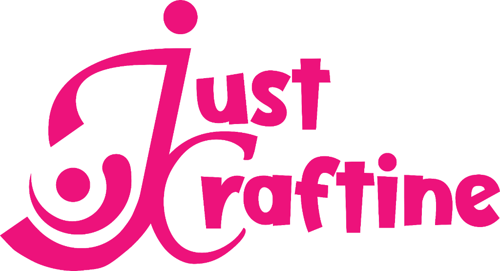
Mother & Baby Concept
The curved 'J' shape subtly references the silhouette of a mother holding a baby, symbolizing care, warmth, and the personal touch behind every product. A nod to Justine's identity as a loving mom.
Scissors Inspiration
The inner swirl and curved stroke are inspired by the form and motion of craft scissors, representing cutting, crafting, and handmade production. Directly tied to Just Craftine's core services.
The Part Nobody Sees
The storefront is the brand. The admin panel is the business. This is the reason I chose Base44 over Shopify: Justine's shop isn't shelf inventory, it's made-to-order work with customization requests and customer-uploaded design references, and a template admin doesn't fit how a maker actually works.
So I designed her a small data product of her own. A dashboard opens on the numbers that matter: monthly order counts and a 12-month orders and revenue chart, so she can see her busy seasons instead of guessing them. The order queue is searchable by name, email, or product and filters across a five-stage lifecycle (pending → confirmed → in progress → completed → cancelled) that mirrors how a custom order actually moves through her kitchen table. Product management handles photo galleries, customization options, and availability and featured toggles without touching code.
And because a back office lives in its in-between moments, the unglamorous states are designed too: loading skeletons while data arrives, empty states before the first order of the day, and a confirmation flow that tells her customers exactly what happens next.
Sales Dashboard
Total Orders
2
This Month
0 orders
Total Revenue
$53.00
Products
8
0 completed
Orders & Revenue, Last 12 Months
- Orders
- Revenue ($)
Dashboard
KPIs + 12-month revenue chart
Orders
Search, filters, 5-stage lifecycle
Products
Galleries, options, availability
States
Loading, empty, confirmation
Tables, filters, lifecycle states, and dashboards, designed for a power user of one. The smallest possible B2B product, shipped and in daily use.
3
Logo Variations
Logomark, Full Logo, Badge
3
Brand Colors
Full Pantone system
5+
Corporate Assets
Cards, tags, packaging
Live
Storefront + Admin Panel
just-craftine.base44.app